

Introduction
Bootstrap is the world's most popular framework for building responsive, mobile-first sites and with the new version of it it has become even more interesting to all of us. Bootstrap 4 has a better grid system than version 3 in my opinion. Actually, some time ago I wrote an article about Bootstrap 3 grid system in which I have explained it in more detail. It's the time to have a look at Bootstrap 4 grid system which brings pretty cool new things. Yalla. Let's go! :)
What exactly is Bootstrap 4 and why would I need it?
Bootstrap 4 is a CSS framework, like I wrote above, and it helps us to build responsive websites from scratch. Why would you need it? Because it has already the whole layout structure defined in a CSS file. All you have to do is just write the HTML code and apply the proper classes. All will be ready without you needing to write CSS code, test it on multiple devices etc. Basically Bootstrap has a maximum of 12 columns layout. Based on built-in CSS, can adapt to various devices in a responsive way. Of course, the whole framework is much more than this, as you will see.
The main grid functionality of Bootstrap 4
Bootstrap 4 can be confusing for beginners. In my opinion the main idea of the grid is that it uses three main classes: .container, .row and .col (columns). Shortly, the HTML code for a very simple Bootstrap 4 grid layout would look something like this:
<div class="container">
   <div class="row">
      <div class="col"> This is a very simple Bootstrap 4 layout </div>
   </div>
</div>
And the above would look like this on a desktop, tablet or other device:
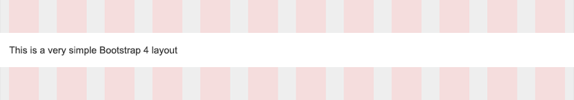
The 12 pink columns you see above are the ones which I mentioned before. I will use this grid background for a better understanding of the whole system.
To be more specific instead of .container we can also have .container-fluid. Instead of .col we can have multiple variants (like for example .col-sm, .col-4 or .col-sm-4). Will discuss all these in more extensive way. I know that the .col part can be really confusing right now, but I will explain this right away. :)
What is .container in Bootstrap 4?
A .container is the most basic element in Bootstrap 4 and it is required when we use this grid system. Bootstrap 4 it is a mobile-first grid system. This means that every CSS class it is declared for small devices (portrait phones, less than 576px). Then it has specific CSS media queries to target also tablets, desktops etc. We will discuss that a little later. To understand a little better how this works let's see how .container class is declared inside the bootstrap.css file:
.container {
     width: 100%;
     padding-right: 15px;
     padding-left: 15px;
     margin-right: auto;
     margin-left: auto;
}
 @media (min-width: 576px) {
     .container {
         max-width: 540px;
    }
}
 @media (min-width: 768px) {
     .container {
         max-width: 720px;
    }
}
 @media (min-width: 992px) {
     .container {
         max-width: 960px;
    }
}
 @media (min-width: 1200px) {
     .container {
         max-width: 1140px;
    }
}
Let's examine the above CSS code. If we understand this clearly, then we will know what means mobile-first. And we will understand the basic principle which stands behind the Bootstrap 4 grid system.
Explanation of Bootstrap 4 media query ranges (breakpoints)
On the above CSS code we can observe that the first declaration is the one of the .container class. This means that the container with this class will behave the same on all devices (phones, tablets, desktops etc.). So a container with .container class will have 100% width, left and right padding of 15px and auto left and right margins on all devices. I think this is clear for everybody, right?
But, wait! Look below this first declaration. What do we have? We have a media query (or a breakpoint) using a minimum width of 576 pixels. What does this mean? It means that on all devices with a minimum viewport width of 576 pixels, which usually are landscape phones for example, the width of the .container will be 540 pixels (max-width: 540px;). And the other things like padding and margins are taken from the first declaration. So we will have 30px (15px + 15px, reft and right padding) + width 540px = 570px, which leave us 6 pixels to the 576px breakpoint (3 pixels on left margin and 3 pixels on right margin which both will increase, of course, with the width of the viewport).
Still not clear?
Ok, I guess things are clear now or not? Because we might ask this: why was the first .container class declaration was made outside the first media query (@media (min-width: 576px) { }) ? Well, here is one of the important things of Bootstrap 4 grid system! The first .container class declaration was made outside of the media query because it addresses to all devices which have a width smaller than 576 pixels! This means that this is the default and that is why Bootstrap is known as mobile-first. The devices with viewport width lower than 576 pixels are portrait phones. So, these Bootstrap 4 breakpoints are mostly based on minimum viewport widths. They allow us to scale up elements as the viewport changes.
Explaining what happens after the first breakpoint
Let's see what happens after the first breakpoint (the 576 pixels one which we discussed above). After that break point, we have another breakpoint at 768 pixels (@media (min-width: 768px) { .container { max-width: 720px; } }). What does this mean? It means that on all devices with a minimum viewport width of 768 pixels the width of the .container will be 720 pixels, to which, of course, we apply the paddings and margins from the first .container declaration.
And, even more, this new breakpoint (at 768 pixels) gives us more clarity about the first breakpoint (at 576 pixels). Why is that? Because now we know that for all devices with a minimum viewport of 576 pixels and a maximum of 767 pixels, the width of the .container will be 540 pixels! You have noticed that I wrote 767 pixels instead of 768 pixels. That is because 768 pixels belongs to the next media query.
So, right now, based on the above explanation, you can check the next breakpoints and see the .container behavior. Or, for an even better understanding of Bootstrap 4 grid system**,** please check the graphic below:

How does .row work in Bootstrap 4?
After we have checked .container and explained the breakpoints let's move to the next class which is .row. The CSS code for this in bootstrap.css file is:
.row {
     display: -ms-flexbox;
     display: flex;
     -ms-flex-wrap: wrap;
     flex-wrap: wrap;
     margin-right: -15px;
     margin-left: -15px;
}
That's right! We have something new! Bootstrap 3 for example used the float property for columns. Bootstrap 4 uses flexbox!
What is flexbox in Bootstrap 4?
I will not get into too much details about flexbox but, shortly, this is a display property like block or inline and using it helps us to design flexible responsive layout structures without using float or positioning. It is supported by all modern browsers and to make it work correctly we need to define first a flex container and in Bootstrap 4 this container is .row. Also .row uses flex-wrap: wrap which means that the items inside it will wrap so they will go one below the other when the browser window is resized. Still a little confused? Don't worry, you will understand this much better when we will discuss about the columns.
What is with the negative margins of .row?
Remember that for the .container we have left and right padding set to 15px. By having negative margins for .row we will actually counteract that .container padding. And furthermore, since columns inside .row, as we will see soon, have a padding of 15px on left and right (called gutter) then all the content in columns is visually aligned down the left side. There is also the .no-gutters class which has 0 margins for rows or 0 padding for columns, in case that you want that.
How is .col working in Bootstrap 4?
Actually .col it is a little more complex, but easy to understand. In Bootstrap 4 we have .col class, but besides this we have many classes, logically structured as I will explain below, where .col- (.col along with "-") is used as prefix. What does this mean? It means that we have classes like: .col-1, .col-sm-1, .col-md-1, .col-lg-1 or .col-xl-1. Confusing? Probably! But, these are easy to understand. Don't get confused about that number "1". Bootstrap 4 has classes like .col-3, .col-sm-8, .col-md-12, .col-lg-2 or .col-xl-10. So the numbers are 1 to 12, and 12 corresponds with the columns number I have mentioned before. Ok, it seems to be clear about the numbers, but what are these: sm, md, lg or xl ? These are actually corresponding to the breakpoints which I have explained above. They allow certain behavior of the columns depending on the viewport.
The classes graphic
To be totally clear it is like this:
- Columns having the classes .col-1 to .col-12 (this means .col-1, .col-2, .col-3, .col-4, .col-5, .col-6, .col-7, .col-8, .col-9, .col-10, .col-11, .col-12) are the "default" classes and they are for extra small devices (portrait phones) with a width less than 576 pixels.
- Then the columns with the classes .col-sm-1 to .col-sm-12 (this means .col-sm-1, .col-sm-2, .col-sm-3, .col-sm-4, .col-sm-5, .col-sm-6, .col-sm-7, .col-sm-8, .col-sm-9, .col-sm-10, .col-sm-11, .col-sm-12) are for small devices (landscape phones) with a width greater than or equal to 576 pixels.
- Columns having the classes .col-md-1 to .col-md-12 (this means .col-md-1, .col-md-2, .col-md-3, .col-md-4, .col-md-5, .col-md-6, .col-md-7, .col-md-8, .col-md-9, .col-md-10, .col-md-11, .col-md-12) are for medium devices (tablets) with a width greater than or equal to 768 pixels.
- Then the columns the classes .col-lg-1 to .col-lg-12 (this means .col-lg-1, .col-lg-2, .col-lg-3, .col-lg-4, .col-lg-5, .col-lg-6, .col-lg-7, .col-lg-8, .col-lg-9, .col-lg-10, .col-lg-11, .col-lg-12) are for large devices (laptops, desktops) with a width greater than or equal to 992 pixels.
- Columns having the classes .col-xl-1 to .col-xl-12 (this means .col-xl-1, .col-xl-2, .col-xl-3, .col-xl-4, .col-xl-5, .col-xl-6, .col-xl-7, .col-xl-8, .col-xl-9, .col-xl-10, .col-xl-11, .col-xl-12) are for extra large devices (large desktops) with a width greater than or equal to 1200 pixels.
If it is still confusing, just check the image below:

Bootstrap 4 grid system examples
Now that we have the basic things much more clear, let's see some examples to understand all these even better.
As you remember from above, I said that we have the .col class. How does this work? It works pretty cool, because it is based on flexbox. The CSS code for this class is:
.col {
     -ms-flex-preferred-size: 0;
     flex-basis: 0;
     -ms-flex-positive: 1;
     flex-grow: 1;
     max-width: 100%;
}
This works like this: if we have two columns with .col classes, they will adjust and each column will be 50% of the .row width. If we have, for example, four columns with .col classes, they will each have 25% of the .row width. Why is this? As I said above, they are flex based and because of flex-grow: 1 and flex-basis: 0 all .col columns in a .row will always have equal widths. This class does not have any breakpoint, so it will behave the same on all devices. Let's take the example with 4 columns. Here's the HTML code:
<div class="container">
   <div class="row">
      <div class="col"> Col 1 </div>
      <div class="col"> Col 2 </div>
      <div class="col"> Col 3 </div>
      <div class="col"> Col 4 </div>
   </div>
</div>
And on a web page it will look like this:

A layout grid example with col-1, col-2, col-3...
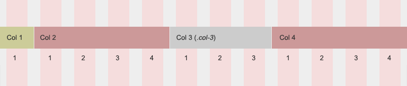
Now, let's a little more complex example. Here's the HTML code:
<div class="container">
   <div class="row">
      <div class="col-5"> Col 1 </div>
      <div class="col-3"> Col 2 </div>
      <div class="col-4"> Col 3 </div>
   </div>
</div>
All these classes .col-1, .col-2 .etc to .col-12 also behave the same for all devices and they have, each one, a certain width defined in Bootstrap 4 CSS. For example .col-1 has a width of 8.333333%, .col-2 has a width of 16.666667%, .col-3 has a width of 25%, .col-4 has a width of 33.333333%, .col-5 has a width of 41.666667%, .col-6 has a width of 50%, .col-7 has a width of 58.333333%, .col-8 has a width of 66.666667%, .col-9 has a width of 75%, .col-10 has a width of 83.333333%, .col-11 has a width of 91.666667% and .col-12 has a width of 100%. Actually all these widths are the same for the other classes like .col-sm-*, .col-md-*, .col-lg-* and .col-xl-*. This means that for example .col-sm-1 will have the same width of 8.333333% like .col-1. Or .col-lg-7 will have the same width like .col-7 which is 58.333333%. But these classes just behave different as they are defined inside the correspondent media queries which I have explained above.
So, the above HTML code will look like the below image. I have added different colors for the columns, just to see exactly the size and also I numbered the pink stripes. As you might realized a pink stripe it is actually .col-1 and the grey on left and right it is just the 15px padding. These columns will behave the same on every device:

A mix of .col and .col-1, .col-2, .col-3 etc
Let's take the below HTML code:
<div class="container">
   <div class="row">
      <div class="col-1"> Col 1 </div>
      <div class="col"> Col 2 </div>
      <div class="col-3"> Col 3 </div>
      <div class="col"> Col 4 </div>
   </div>
</div>
We have two columns (.col-1 and .col-3) which have predefined widths and the other two columns (Col 2 and Col 4) will be equal (they take the remaining space and share it equally thanks to flexbox settings) like in the image below:
Bootstrap 4 grid example with the other four tiers of predefined classes
Now it is the time to look to some little more complex examples of grid layouts. So far we had examples with .col and .col-* classes and now will have some examples with the other classes like .col-sm-*, .col-md-*, .col-lg-* and .col-xl-* and see how these behave at different breakpoints.
Here's a HTML code example:
<div class="container">
   <div class="row">
      <div class="col-md-2"> Col 1 </div>
      <div class="col-xl-3"> Col 2 </div>
      <div class="col-sm-1"> Col 3 </div>
      <div class="col-lg-6"> Col 4 </div>
   </div>
</div>
The below image will show you how the above code behaves on different viewports going from the smallest one to the biggest one:

A complex Bootstrap 4 layout using a combination of different classes for each tier
<div class="container">
   <div class="row">
      <div class="col-4 col-sm-8"> Col 1 </div>
      <div class="col-6 col-lg-10"> Col 2 </div>
      <div class="col col-xl-5"> Col 3 </div>
      <div class="col-9 col-md-7 col-lg-2"> Col 4 </div>
   </div>
</div>
And the image below will show how the above code will look on different devices:

Conclusion about Bootstrap 4 grid system
Bootstrap 4 is better than previous version and I think that I have covered all the major aspects above. I'm sure no one will have difficulties in understanding other things related to grid layout, like horizontal alignment, reordering or offsetting. But if you have other questions or suggestions please let me know.
Comments closed
Please contact me, if you have any questions or suggestions.