

Introduction
CSS Grid Layout it is a generalized system based on rows and columns.
Create a grid container
The first step it is to define a grid container: dislay:grid;. The elements inside the grid container are the grid items.
There are two types of grids: regular grids (display:grid;) and inline grids (display:inline-grid;).
You can see the difference between these two in the below image:

CSS grid terminology
We already talked about the grid container which is a box that establishes a grid-formatting context. This container is an area in which a grid is created and elements are laid out based on the rules of grid layout instead of block layout.
A grid item is an element that participates in grid layout within a grid-formatting context and it is usually a child element of a grid container.
To have a better understanding of CSS grid, we need to know the core components. The below image will explain the most important ones:

The grid line, horizontal or vertical, is the most fundamental unit. By defining the placement of one or more grid lines, we implicitly create the rest of the grid's components:
- grid track is a a grid column or a grid row - a continuous run between two adjacent grid lines. It goes from one edge of the grid container to the other. Column tracks are on the block axis and row tracks are on the inline axis.
- grid cell is any space bounded by four grid lines, is the smallest unit of area in grid layout and cannot be directly addressed with CSS grid properties (except when a cell is considered an area - see below).
- grid area is any rectangular area bounded by four grid lines, and made up of one or more grid cells. An area can be as small as a single cell, or as large as all the cells in the grid. Grid areas are directly addressable by CSS grid properties.
These grid tracks, cells, and areas do not have to correspond to grid items and they are entirely constructed of grid lines.
It is perfectly possible to have some or even most of a grid's cells be empty of any content and it's also possible to have grid items overlap each other.
We can define as many or as few grid lines as we want (so we can create just one row or just one column).
Placing grid lines
There are many different ways to place grid lines, each using slightly different syntax.
Will look into these by looking at two closely related properties: grid-template-rows and grid-template-columns.
GRID-TEMPLATE-ROWS, GRID-TEMPLATE-COLUMNS
Values: none | 'track-list' | 'auto-track-list' | subgrid 'line-name-list'?
Default value: none
Applies to: Grid containers
Inherited: No
Percentages: Refer to the inline size (usually width) of the grid container for grid-template-columns, and to the block size (usually height) of the grid container for grid-template-rows
Computed value: As declared, with lengths made absolute
With these properties, you can define the grid lines in your overall grid template, or what the CSS specification calls the explicit grid.
A grid line can always be referred to by a number, and can also have a name.
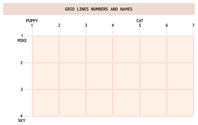
As you can see in the above image, a line can have a number, but also a name.
Now that we know these basic concepts, we can start with the simpler ways to define a grid template and work our way toward the more complex.
Fixed-width grid tracks
In this case, "fixed-width" means the grid lines are placed such that the distance between them does not change due to changes of content. This doesn't mean a fixed length like pixels or ems; percentages also count as "fixed-width" here.
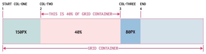
Let's take an example:
#mygrid {
  display: grid;
  grid-template-columns: 150px 40% 80px;
}
As you can see above, we always have a line at the start of the grid container. Then a first grid line (number 2) is placed 150 pixels from the start of the grid container (by default, the left side), a second grid line (number 3) 40% of the width of the grid container away from the first; and a third grid line 80 pixels away from the second.
In this context, fixed-width means the grid lines are placed such that the distance between them does not change due to changes of content. So no matter how wide or narrow is the content in the second column, that column will also be 40% of grid container width.
As you can see, the last grid line doesn't reach the right edge of the grid container. It is just fine as it doesn't have to. If you want it to — and you probably will — we'll see various ways to deal with that.
When we want to name the grid lines, things are also easy, but a bit different.
Just add names to the grid lines (you can add just to some lines or to all lines; it is up to you) in the appropriate place in the value, surrounded by square brackets.
Let's have the previous example, but this time with lines names:
#mygrid {
  display: grid;
  grid-template-columns: [start col-one] 150px [col-two] 40% [col-three] 80px [end];
}
So, for the three widths we have, there are four grid lines created. Each value is actually specifying a grid track's width, which means there is always a grid line to either side of a width value.
Let's have an example with rows also:
#mygrid {
  display: grid;
  grid-template-columns: [start col-one] 150px [col-two] 40% [col-three] 80px [end];
  grid-template-rows: [start header] 90px [content] 250px [footer] 50px [end];
}
As you can see, some column and row lines have the same names and that it is no problem. The rows to not fill the space because the grid container height, in this case, it is bigger.
If we make one of the rows to be 100%, then the rows will exceed the grid container height.
One solution would be to use minmax for one row's value.
#mygrid {
  display: grid;
  grid-template-columns: [start col-one] 150px [col-two] 40% [col-three] 80px [end];
  grid-template-rows:
    [start header] 90px [content] minmax(250px, 100%)
    [footer] 50px [end];
}
In the above case, the content row can never be shorter than 250px tall, and never taller than the grid container itself. In the minmax(a,b) pattern, a is the minimum size and b is the maximum size. One important thing about minmax is that if the max is smaller than the min, then the max value is thrown out and only the min value is used.
Flexible grid tracks
Our examples so far had inflexible grid tracks because their size was fixed. Flexible grid tracks can be based on the amount of space in the grid container not consumed by inflexible tracks, or alternatively, can be based on the actual content of the entire track.
Fractional units
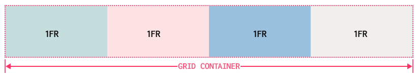
In this case we will use the fr unit which it is pretty popular.
If we want to divide the grid container into four columns we just need to add this:
#mygrid {
  display: grid;
  grid-template-columns: 1fr 1fr 1fr 1fr;
}
We can use different fractional units:
#mygrid {
  display: grid;
  grid-template-columns: 1fr 2fr 1fr;
}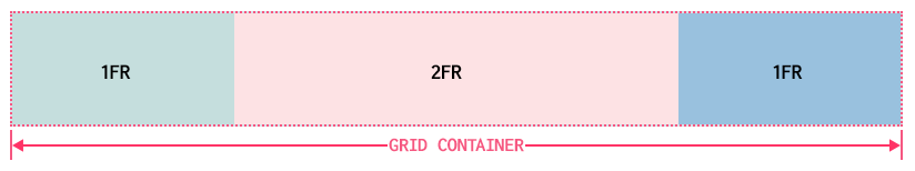
In the above case, the base fr is 0.25 (1/(1+2+1)). This means that the left and right columns widths will be 25% and the middle column width value will be 50% (2fr = 2*0.25) of the grid container.
Fractional units are not limited to integers:
#mygrid {
  display: grid;
  grid-template-columns: 1fr 5.73915fr 1fr;
}
In the above case the base fr = 1/(1+5.73915+1).
But the real power of fr units is when we have some columns fixed-width:
#mygrid {
  display: grid;
  grid-template-columns: 10em 1fr 30%;
}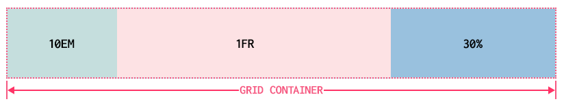
In the above example, the second column will actually fill all the remaining grid container space because the base fr is 1. So after 10em and 30% are deducted from the grid container width, the remaining space is divided by 1.
Content-aware tracks
Min-content and max-content come into play when you want to line up a bunch of pieces of a page and you can't guarantee how wide or tall they might get.
Shortly, max-content means to "take up the maximum amount of space needed for this content." For large blocks of text (like a blog post), this would generally mean taking as much room as is available, in order to maximize the space for that content.
On the other side, min-content means to "take up the bare minimum space needed for this content." With text, that means squeezing the width down to the point that the longest word (or widest inline element, if there are things like form inputs or images) sits on a line by itself. That would lead to a lot of linebreaks in a very skinny, very tall grid element.
What's really powerful about these sizing keywords is that they apply to the entire grid track they define. For example, if you size a column to be max-content, then the entire column track will be as wide as the widest content within it.
Repeating grid lines
When you want to set up many grid lines, not just three of four like in our previous examples, you don't haveto type out every single one of them. CSS grid offers us repeat():
#mygrid {
  display: grid;
  grid-template-columns: repeat(12, 7em);
}
The above will generate twelve column tracks, each one 7em wide, for a total of 84 ems of column tracks.
We can even put together more that one sizing value:
#mygrid {
  display: grid;
  grid-template-columns: repeat(4, 3em 1fr 1fr);
}
The above will generate twelve column tracks in this order: 3em 1fr 1fr 3em 1fr 1fr 3em 1fr 1fr 3em 1fr 1fr.
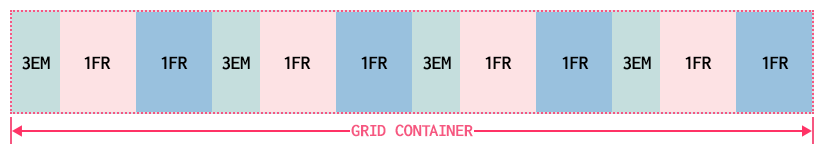
Even more than this, repeat can be combined with any other track-sizing values — even other repeats — in the construction of a grid.
#mygrid {
  display: grid;
  grid-template-columns: repeat(4, 3em 1fr 1fr) 5em;
}
One important thing to know is that we cannot nest a repeat inside another repeat.
We can even use lines names inside repeat:
#mygrid {
  display: grid;
  grid-template-columns: repeat(4, 35px [start] 270px [end]) 8px;
}
One important thing here is that that if we place two named lines next to each other, they'll be merged into a single, double-named grid line. So the below lines will do exactly the same thing:
#mygrid {
  display: grid;
  grid-template-rows: repeat(3, [puppy] 3em [cat]);
}
#mygrid {
display: grid;
grid-template-rows: [puppy] 3em [cat puppy] 3em [cat puppy] 3em [cat];
}As you can see, we will have lines having the same name, but that, as we will see, it will not be a problem.
Auto-filling tracks
We also have a way to set up a simple pattern and repeat it until the grid container is filled, using auto-fill.
#mygrid {
  display: grid;
  grid-template-rows: repeat(auto-fill, [puppy] 3em [cat]);
}
When use auto-fit, tracks that don't contain any grid items will be dropped. Let's take the following example:
#mygrid {
  display: grid;
  grid-template-columns: repeat(auto-fit, 16em);
}
In the above case, if there's room for six column tracks in the grid container, but three tracks don't have any grid items to go into them, those empty grid tracks will be dropped.
Grid areas
Grid areas are cool, powerful and pretty easy to use. With these you can create complete grid templates.
GRID-TEMPLATE-AREAS
Values: none | 'string'
Default value: none
Applies to: Grid containers
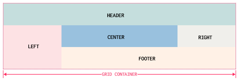
Let's have an example to see how easy and powerful are grid areas:
#mygrid {
  display: grid;
  grid-template-areas:
    "header header header header"
    "left content content right"
    "left footer footer footer";
}
The above will generate a layout with a header, a left and right sidebar, content and footer. But in order for this to really work, you need to assign these areas to the grid items inside the grid container. So the code will be something like:
#mygrid {
  display: grid;
  grid-template-areas:
    "header header header header"
    "left content content right"
    "left footer footer footer";
}
#first-item {
  grid-area: header;
}
#second-item {
  grid-area: left;
}
#third-item {
  grid-area: content;
}
#fourth-item {
  grid-area: right;
}
#fifth-item {
  grid-area: footer;
}
The names of the grid areas do not matter. They can be just a letter or any other character.
Each individual identifier represents a grid cell. Once all the cells are identified, the browser merges any adjacent cells with the same name into a single area that encloses all of them (but all these adjacent cells need to describe a rectangular shape - if you look at the "left"-s for example, they describe a rectangular shape).
Notice that we use grid-area.
When you want to leave some cells unlabeled, you need to use null cell tokens:
#mygrid {
  display: grid;
  grid-template-areas:
    "header header header header"
    "left ... ... right"
    "left footer footer footer";
}
When you want to size the grid tracks created by these areas, we bring in grid-template-columns and grid-template-rows:
#mygrid {
  display: grid;
  grid-template-areas:
    "header header header header"
    "left ... ... right"
    "left footer footer footer";
  grid-template-columns: 1fr 18em 18em 1fr;
  grid-template-rows: 45px 12em 45px;
}
When you name a grid area names are automatically added to the grid lines at its start and end. For the header area, thereis an implicit header-start name on its first column-grid line and its first row-grid line, and header-end for its second column and row grid lines.
For the footer area, the footer-start and footer-end names are automatically assigned to its grid lines.
Attaching elements to the grid
Using Column and Row Lines
GRID-ROW-START, GRID-ROW-END, GRID-COLUMN-START, GRID-COLUMN-END
Values: auto | 'custom-ident' | [ 'integer' && 'custom-ident'? ] | [ span && [ 'integer' || 'custom-ident' ]]
Default value: auto
Applies to: Grid items and absolutely positioned elements, if their containing block is a grid container
Let's take the below example:
#mygrid {
  display: grid;
  grid-template-rows: repeat(5, 4em);
  grid-template-columns: repeat(9, 4em);
}
.item-one {
  grid-row-start: 2;
  grid-row-end: 4;
  grid-column-start: 2;
  grid-column-end: 4;
}
.item-two {
  grid-row-start: 1;
  grid-row-end: 3;
  grid-column-start: 5;
  grid-column-end: 10;
}
.item-three {
  grid-row-start: 4;
  grid-column-start: 7;
}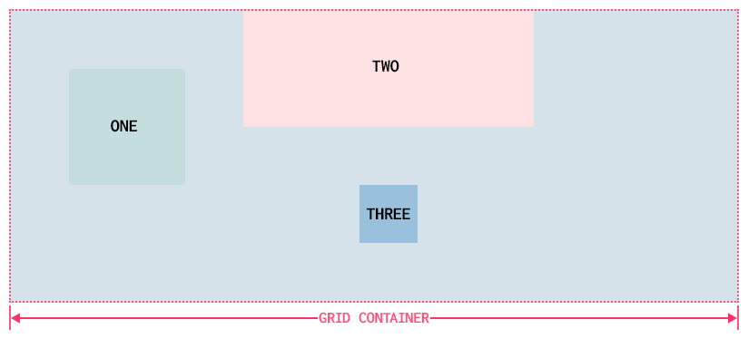
The placement of the above three grid items is done by the rows or columns numbers.
We can also use span for ending values to have the same results. So the item-one from the above example could be written like this:
.item-one {
  grid-row-start: 2;
  grid-row-end: span 2;
  grid-column-start: 2;
  grid-column-end: span 2;
}
An interesting thing is that negative numbers can be used and will count backward from the end of explicitly defined grid lines. Thus, to place an element into the bottom-right grid cell of a defined grid, regardless of how many columns or rows it might have, you just need to use something like this:
#mygrid {
  display: grid;
  grid-column-start: -1;
  grid-row-start: -1;
}
It's also good to know that grid areas create implicit named grid lines.
Row and column shorthands
GRID-ROW, GRID-COLUMN
Values: grid-line [ / grid-line ]?
Default value: auto
Applies to: Grid items and absolutely positioned elements, if their containing block is a grid container
Let's take this example:
.item-one {
  grid-row: cat / dog;
  grid-column: chair / table;
}
For both grid-row and grid-column, the first part defines the starting grid line and the second part defines the ending grid line. Much simpler to write and understand than the prevous properties.
If there is just one name for the starting grid line, then the ending grid line is given that same name.
If a single number is given, then the second number (the end line) is set to auto.
The implicit grid
This happens when we try to place a grid item outside the explicit grid. Will not talk too mch about it here.
Grid flow
GRID-AUTO-FLOW
Values: [ row | column ] || dense
Default value: row
Applies to: Grid containers
This property controls how the auto-placement algorithm works, specifying exactly how auto-placed items get flowed into the grid.
Automatic grid lines
GRID-AUTO-ROWS, GRID-AUTO-COLUMNS
Values: length | percentage | flex | mincontent | max-content | minmax (min,max)
Default value: auto
Applies to: Grid containers
These properties specify the size of an implicitly-created grid row track or pattern of tracks.
The grid shorthand
GRID
Values: none | subgrid | [ grid-template-rows / grid-template-columns ] | [ linenames? string track-size? line-names? ]+ [ / track-list ]? | [ grid-auto-flow [ grid-auto-rows [ / grid-auto-columns ]? ]? ] ]
Default value: auto
Applies to: Grid containers
It is a complex thing, but you can get the idea. Just wanted to have it here.
Opening grid spaces
GRID-ROW-GAP, GRID-COLUMN-GAP
Values: length
Default value: 0
Applies to: Grid containers
A gutter is a space between two grid tracks.
Conclusion
Grid layout is really complex. I really hope that this article will help you to understand it better and to use it in your web projects.
Comments closed
Please contact me, if you have any questions or suggestions.